STYLE - Refinement
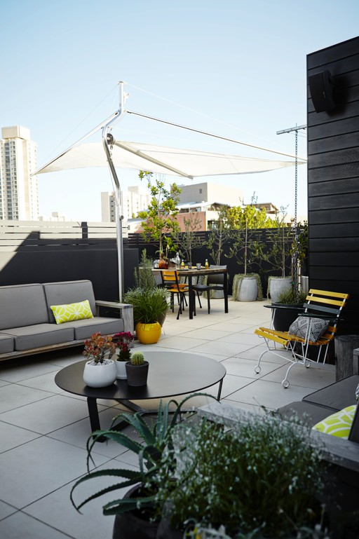
Mosman Garden by Harrisons Landcaping • Photography by Natalie Hunfalvay
Toning Down The Colour
I have found myself recently to be toning down my colour schemes. If you're at all familiar with my work, it would be fair to say I am a lover of colour and not afraid to use it and play hard with it. Lately I have been inspired by spaces and other designers that use little colour and therefore have witnessed myself practicing that movement.
There is a term when it comes to colour called monochromatic. Mono meaning one and chroma meaning colour. Used in reference you can have a monochromatic colour scheme. As I'm sure you've picked up this is when you use only one colour in a scheme. Now black, whites and greys aren't deemed colours instead labelled as tones, so you can incorporate variances of these into your monochromatic colour scheme.
A monochromatic colour scheme creates a calm, harmonious, restful space and used with a lot of black and white I believe to have a timeless feel with sophistication. The use of just one colour is very harmonious on the eyes for the people in the space and is easy to live with. I have some examples below to show you where I have used this colour scheme in my work. For some people this might still look like a lot of colour, but for me i feel like i'm toning it down!
Landscape Design and Landscape Styling by Adam Robinson Design • Photography by Natalie Hunfalvay
Landscape Design and Landscape Styling by Adam Robinson Design • Photography by Natalie Hunfalvay
Landscape Design and Landscape Styling by Adam Robinson Design • Photography by Natalie Hunfalvay
Landscape design and implementation by Valley Garden Landscapes • Photography by Natalie Hunfalvay • Landscape Styling by Adam Robinson Design
I hope I've inspired you and given you some confidence in embarking on a colour scheme in your space.


